Visualizations of US neighborhoods by race and ethnicity
HOMOPHILY + MAPS WITHOUT MAPPING SOFTWARE
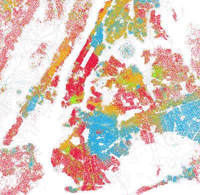
In the past, Decision Science News has posted about homophily (“birds of a feather shop together“) and cool, lightweight visualizations (“maps without map packages in R“). Today, both topics come together in Eric Fischer’s fascinating set of images on Flickr called “Race and Ethnicity”(*). According to Eric:
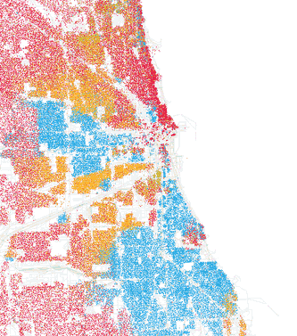
Red is White, Blue is Black, Green is Asian, Orange is Hispanic, Gray is Other, and each dot is 25 people. Data from Census 2000.
Your Editor had just thought this was just an interesting visualization, but a few seconds after emailing it to Jake and Sharad, the latter called out “homophily!” from a few desks away, making a sensible tie-in to our paper. To refresh the collective memory:
Homophily is the idea that people who are in contact with one another tend to be similar in a number of dimensions.
Here we guess a less friendly term for it would be segregation, though that word is often used with some sense of causality (e.g. a dictionary speaks of “enforced” or “voluntary” segregation), whereas homophily is plainly correlational.
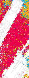
One funny thing about this representation is that it can make things look exaggerated when population density is high. For instance, on the Upper East Side of Manhattan (just to the right of the sharp rectangle that is Central Park, a third of the way down from the top) it looks like everybody is white. However, there are places that are just as white, but seem less so because of lower population density (e.g., the bit of New Jersey on the upper left). The white space makes things seem less, well, white. Also, if you zoom in on the Upper East Side, as below, one can see it is not pure red:
Now for another former home of Decision Science News: Chicago. The little red blob on the coast about two-thirds of the way down is the University of Chicago / Hyde Park. Your editor remembers being a student and making regular 20-minute drives to the orange blob due West of campus to get burritos at the original Maravillas.
(*) Well, it is not exactly without mapping software, but the background image adds little.
H/T Eric Fischer. I found out about these pics from Mike Arauz. I also just learned that Andrew Gelman has blogged about this, too http://www.stat.columbia.edu/~cook/movabletype/archives/2010/09/how_segregated.html


Very impressive. Great to see these maps making the The Daily Mail (http://www.dailymail.co.uk/news/article-1315078/Race-maps-America.html) and a Washington Post blog (http://voices.washingtonpost.com/blog-post/2010/09/racial_segregation_of_dc_and_o.html), although . Rare amongst the R community, Mr. Fischer has earned a link on Drudge!
September 25, 2010 @ 11:01 pm
[…] Hier. […]
October 23, 2010 @ 9:34 pm