The housing bubble by city
DIFFERENT CITIES TELL DIFFERENT STORIES
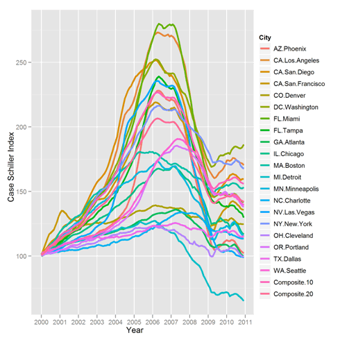
Inspired by a tutorial called 5 Minute Analysis in R: Case-Shiller Indices, we decided to redo the analysis with 1) More up to date data and 2) Hadley Wickham’s super ggplot2 graphics package.
The above plot shows the general trend in home prices, relative to January 2000, in various cities, but is otherwise a mess.
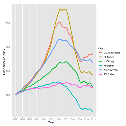
Much like Olympic sports coverage, we next focus in on a few exceptional stories. It is much easier to read.
Miami sailed high and fell far. Detroit rose modestly and but dropped more than it went up. Dallas held steady. DC is enjoying a bit of renewed growth, but are it and New York yet to fall?
The graphs were surprisingly easy to create in R, and the full code is below. If you’d like to do your own analysis, the Standard & Poor’s Web site has data that you can download yourself. We chose the “seasonally adjusted” data set.
New to us in the code below was the “droplevels‘ command which was added to R’s version 12. It dispenses with unused factor levels that you sometimes end up with when subsetting data. Extra levels are often harmless, but in ggplot2 they show up in the legend. Without droplevels, the second graph would have the legend of the first graph.
library(ggplot2)

## Read in data, available from:

#www.standardandpoors.com/indices/sp-case-shiller-home-price-indices/en/us/?indexId=spusa-cashpidff--p-us----

dat=read.csv("CSHomePrice_History.csv")

mdf=melt(dat,id.vars="YEAR")

mdf$Date=as.Date(paste("01-",mdf$YEAR,sep=""),"%d-%b-%y")

names(mdf)=c("MonthYear","City","IndexValue","Date")

ggplot(data=mdf,aes(x=Date,y=IndexValue)) + geom_line(aes(color=City),size=1.25) +

scale_x_date("Year", minor="years")  + scale_y_continuous("Case Schiller Index")

sm=subset(mdf,City %in% c('NY.New.York','FL.Miami','CA.Los Angeles','MI.Detroit',

'TX.Dallas','IL.Chicago','DC.Washington'))

sm$City=droplevels(sm$City)

ggplot(data=sm,aes(x=Date,y=IndexValue)) + geom_line(aes(color=City),size=1.5) +

scale_x_date("Year", minor="years")  + scale_y_continuous("Case Schiller Index")


[…] Decision Science News has a wonderful graphic on the visualizing the housing bubble, using the Stand… This is a really nice graphic, one of those that is both simple yet complex, and you can spend a lot of time thinking about what the different trajectories mean in terms of the extent and timing of the bubble. This is their first graphic–go to the website and read the rest of the presentation. A second, cleaner graphic calls out the ‘exceptional’ stories–a good way to build a narrative with graphics: first show the whole picture, then select what people should take away. […]
March 21, 2011 @ 1:17 pm
Would also be a good case for the directlabels package, which could add the legend directly to the end of the lines.
library(directlabels)
direct.label(theplot, last.qp)
March 21, 2011 @ 6:51 pm
I can’t get directlabels to work on the above plot. If anyone can, let it be known!
March 23, 2011 @ 12:43 pm
The new version 2.0 of directlabels supports ggplot2 quite a lot better, so it should now work out-of-the-box with your plot. Try
theplot <- ggplot()+ …
install.packages("directlabels")
library(directlabels)
direct.label(theplot)
August 31, 2011 @ 7:53 am
I cant reproduce the code.The line
mdf=subset(mdf,yr>1999)
gives me 0 obs. of 5 variable (in workspace of RStudio).
Code was copies from
R-bloggers website.
http://www.r-bloggers.com/the-housing-bubble-where-are-we/?utm_source=twitterfeed&utm_medium=twitter&utm_campaign=Feed%3A+RBloggers+%28R+bloggers%29
July 26, 2012 @ 6:06 pm
[…] spring we looked at the state of the housing bubble in the US. The question on readers’ minds then was “where is it going next”? Since Decision […]
July 30, 2012 @ 1:26 am