Best graph ever
Filed in Gossip ,Ideas ,R ,Tools
 Subscribe to Decision Science News by Email (one email per week, easy unsubscribe)
 Subscribe to Decision Science News by Email (one email per week, easy unsubscribe)
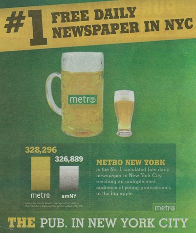
LARGEST EVER DIFFERENCE BETWEEN 328 and 327 SPOTTED IN NEW YORK CITY
Decision Science News was amused to see the above advertisement while riding to work.
If the bottom of the bars is zero, and the metro bar is correctly labelled, the amNY bar is at 240,000. We used PlotDigitizer to steal the points from the graph.
This is without doubt the best graph ever, and we have some tough competitors.
The beer sizes are super-informative too. What is that, a 10:1 difference? We should ask our Pierre Chandon and Nailya Ordabayeva.


Really the best graph…
July 4, 2011 @ 1:52 pm
[…] Science News is no stranger to misleading infographics in free New York newspapers. We could upgrade to real newspapers, but we find that playing “spot the infographic […]
August 15, 2011 @ 3:15 pm
[…] addthis_config={"data_track_clickback":true};Dan Goldstein points us to this:It’s a good infovis–it grabs the reader’s eye (see discussion here), no? Filed […]
August 21, 2011 @ 9:49 am
Some things in here I have not thought about before.Thanks for making such a cool post which is really very well written
Some things in here I have not thought about before.Thanks for making such a cool post which is really very well written
clavier arabe
arabic keyboard
gogle
قياس سرعة النت
gogle
teclado arabe
tastiera araba
ecrire en arabe
virtuel clavier
492 links
December 29, 2012 @ 6:51 am