False alarms and terrorist screening
USING GRAPHICAL DISPLAYS TO COMMUNICATE TERRORISM RISKS

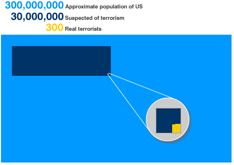
Jon Baron sent over this timely article http://news.bbc.co.uk/1/hi/magazine/8153539.stm
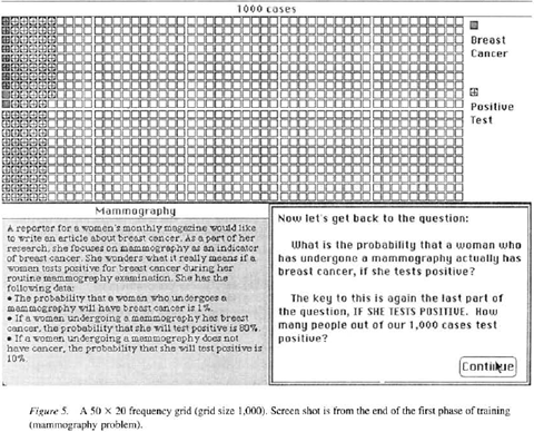
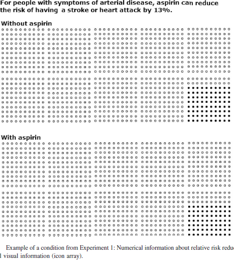
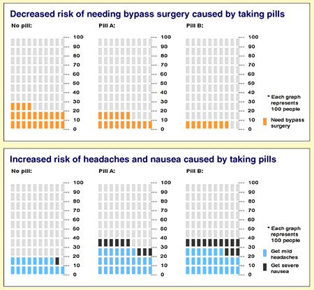
I like the way the author suggests visual representations (as above) to make the point. That particular representation seems vaguely familiar. I wonder if the author knows there’s been quite a bit of research done on it.
1) Sedlmeier, P., & Gigerenzer, G. (2001). Teaching Bayesian reasoning in less than two hours. Journal of Experimental Psychology: General, 130, 380–400.

2) Galesic, M., Garcia-Retamero, R., & Gigerenzer, G. (2009). Using icon arrays to communicate medical risks to low-numeracy people. Health Psychology, 28(2), 210-216.

3) This one just in via the comments:
Hawley, S.T., Zikmund-Fisher, B., Ubel, P., Jancovic, A., Lucas, T., Fagerlin, A. (2008). The impact of the format of graphical presentation on health-related knowledge and treatment choices. Patient Education and Counseling, 73, 448-55.


3) Hawley, S.T., Zikmund-Fisher, B., Ubel, P., Jancovic, A., Lucas, T., Fagerlin, A. (2008). The impact of the format of graphical presentation on health-related knowledge and treatment choices. Patient Education and Counseling, 73, 448-55.
July 29, 2009 @ 8:58 pm
[…] Goldstein notes the intuitiveness of using graphical representations of probability, especially in Bayesian […]
July 29, 2009 @ 9:17 pm
Hi Dan,
Maybe a bit more “designy” approach to the decision science insights that I liked http://www.toby-ng.com/graphic-design/the-world-of-100/
And BTW, Andrei Michael Herasimchuk is joining the Yahoo team as lead Designer for all their products inclusive Flickr (Sr. Product Designer as he calls it).
Maybe a nice idea to meet up with him. Andrei is really cool and maybe you could do some good stuff together.
I know Andrei from a conference I initiated around his publications (http://designbyfire.nl/2009/about/)
Best regards,
Arjan
September 22, 2009 @ 9:52 am
Thanks, Arjan!
September 22, 2009 @ 11:53 am